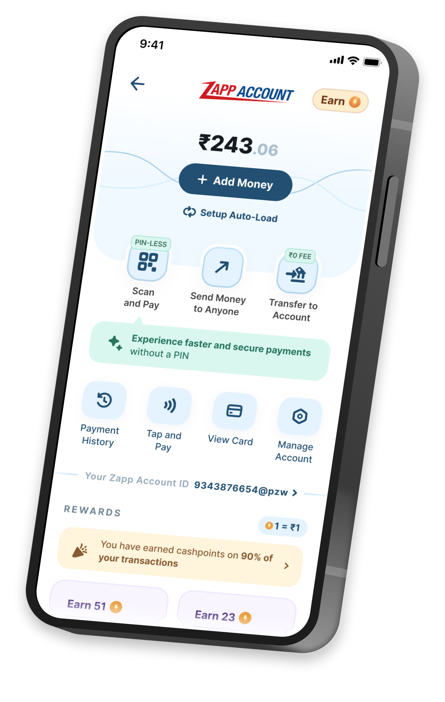
Value first communication - Rejected Approach
We explored this approach parallely but decided not to go ahead with it.
Here communication would take the front seat. Instead of naming what each part of the account did, every surface would lead with the value someone was already getting from it. The focus settled on three things: speed, convenience, and rewards.
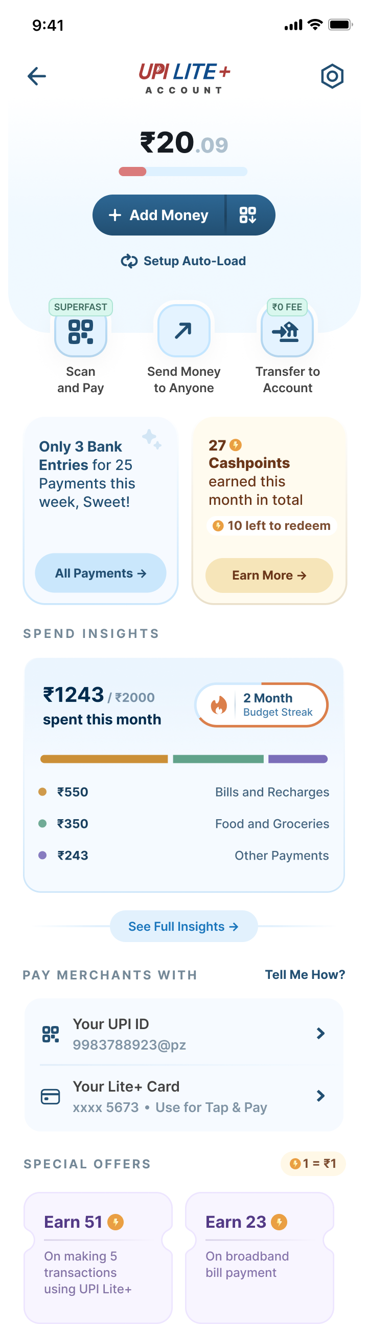
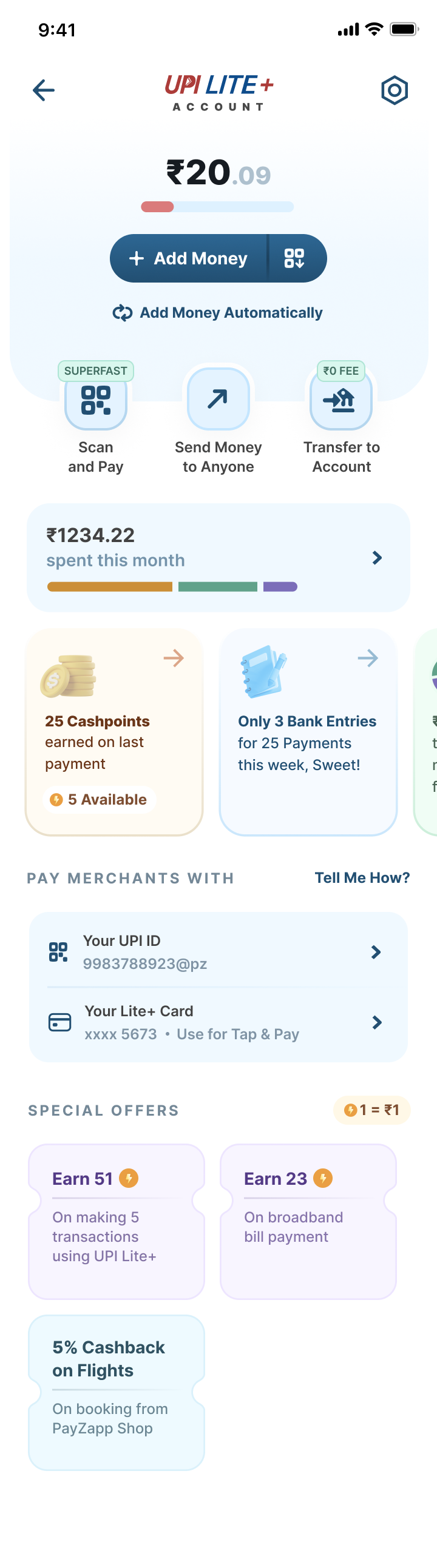
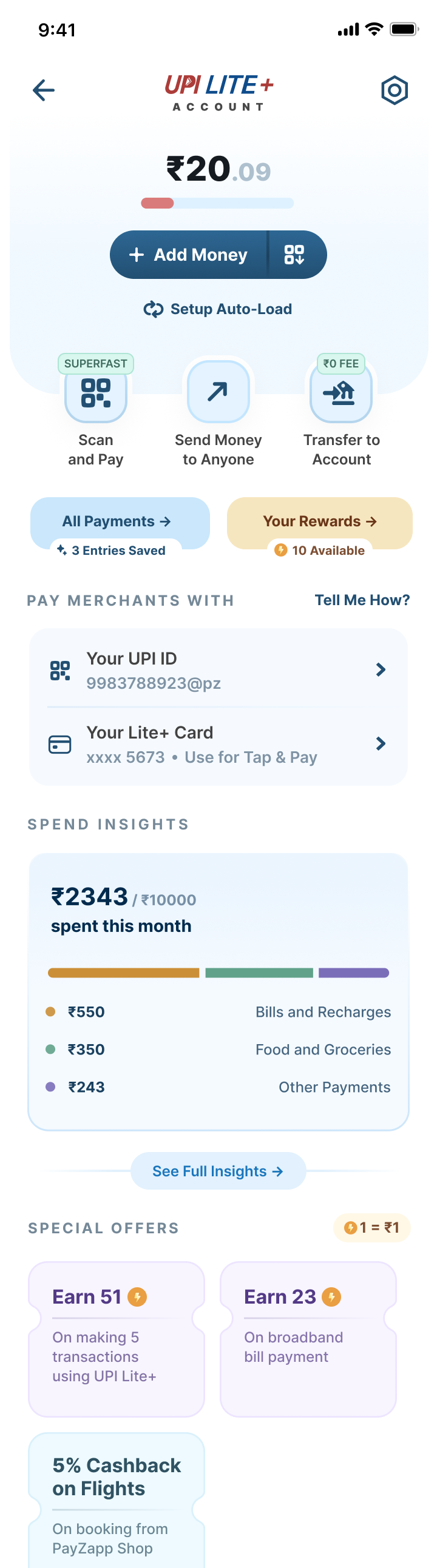
In practice that meant surfacing what a user had already saved or earned. The passbook could tell you how many statement entries you had avoided. Rewards could show how many cashbacks you had collected across the lifetime of the account. We also looked at badges that would attach an adjective to each anchor icon, so Scan and Pay would carry a “superfast” badge rather than just a label.
What it came down to was cognitive load. Fusing value into the anchor icons would have meant simple, everyday actions having to be read and decoded rather than simply recognised, and people are already wired to scan for the plain thing they came for. Someone looking for their passbook is looking for the word passbook as opposed to count of the entries they saved.
It can be a secondary surface shot, but the key actions have to be very clear. We weren’t really keen on creating dedicated extra surfaces just to convey values.
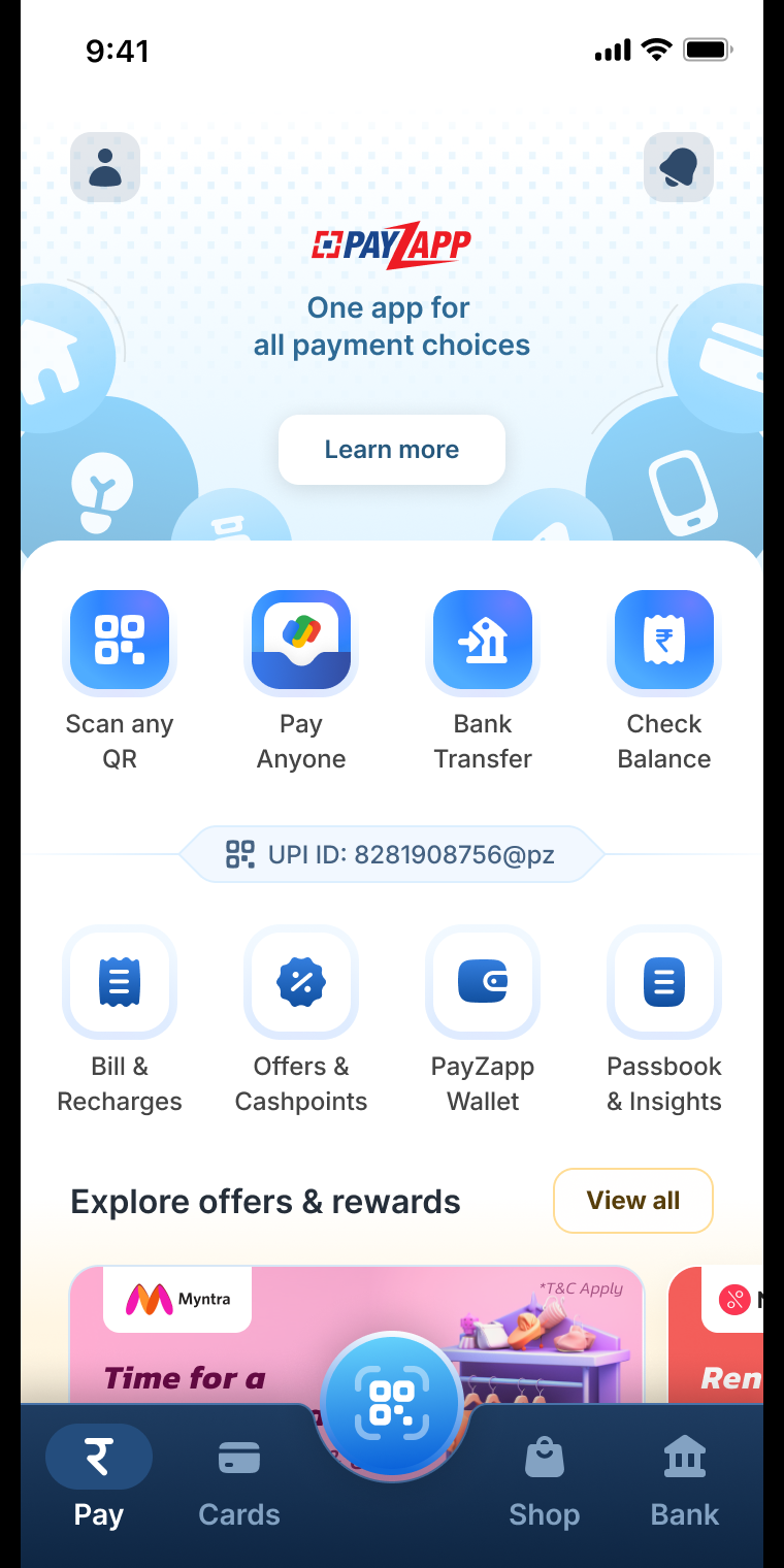
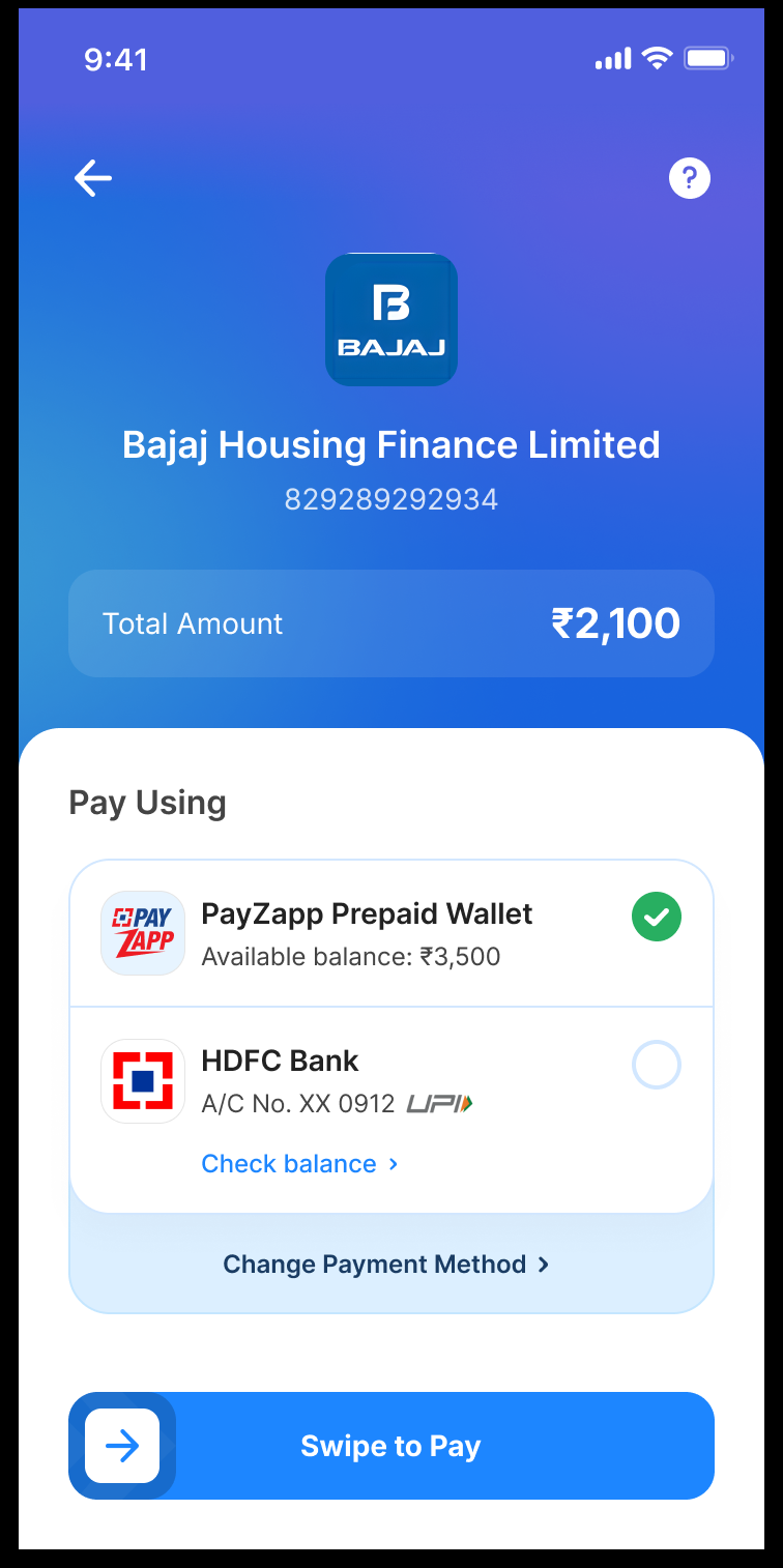
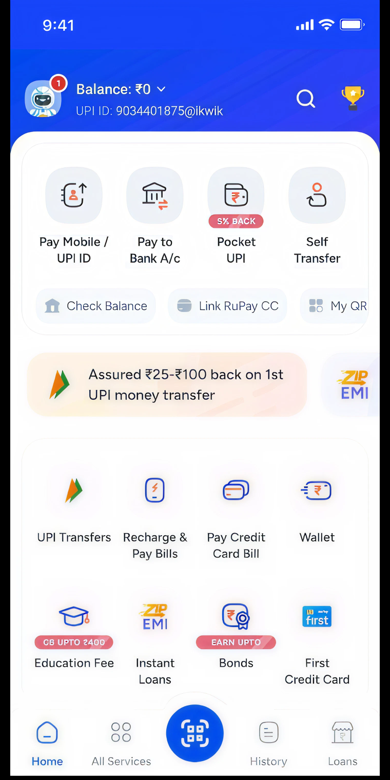
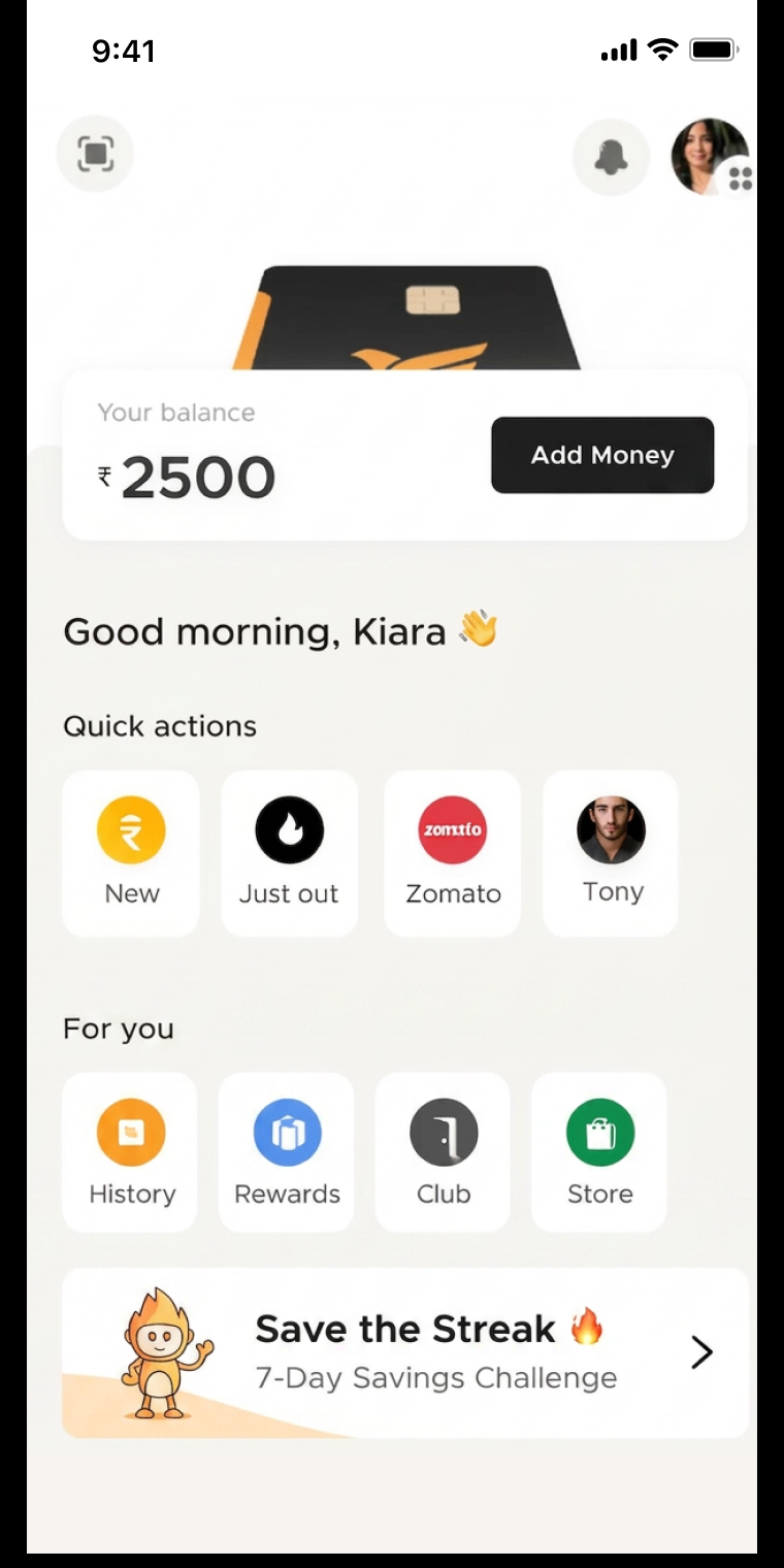
Below are a few of the iterations we tried for a communication-led Zapp Account home page.
 Add image in edit mode
 Add image in edit mode
 Add image in edit mode
Explorations for Zapp Account's Future
The three approaches that follow are the ones we were leaning towards the most, and the ones we planned to take to the bank as where Zapp Account could go next. They all circle the same question, of how the account could help someone stay on top of what they spend, and they arrived in this order: each one came out of what the previous one taught us.
01 / Budget Approach
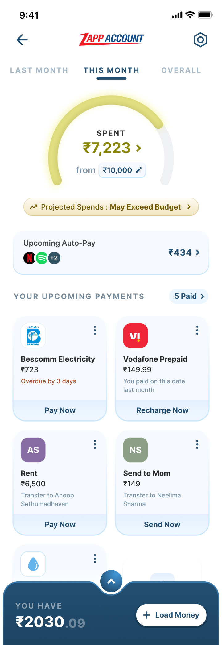
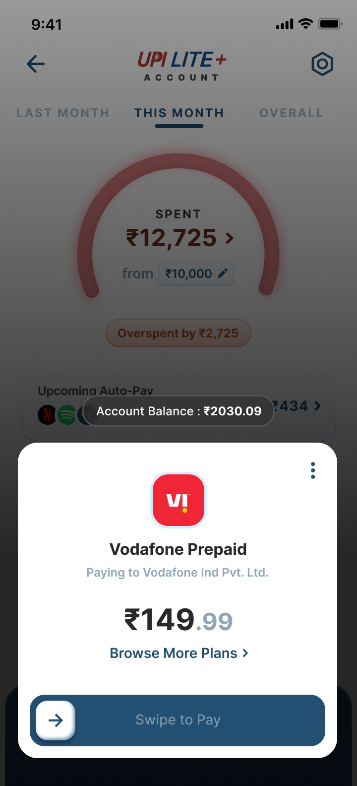
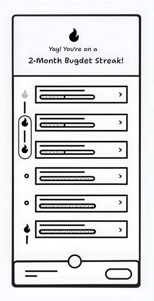
This approach assumed a salaried user with a predictable monthly income, split across discretionary and non-discretionary spends. It would let people set their own monthly budget and track it against a meter, nudging them as they neared the line and calling it out once they crossed it.
Working through it surfaced something we kept running into. A budget almost always resolves into a negative moment, because most people do spend past the number they set, which would mean the product delivering bad news on a schedule. It is also counterintuitive for a spending account to discourage spending: we wanted Zapp Account to assist rather than to police anyone’s habits.
We did not throw the approach away for that. The observation was useful in itself, and it pointed at what to try next: keep the visibility a budget gives someone, and drop the verdict attached to it. That is what led to the next approach.
 Add image in edit mode
 Add image in edit mode
 Add image in edit mode
02 / Insights instead of a limit
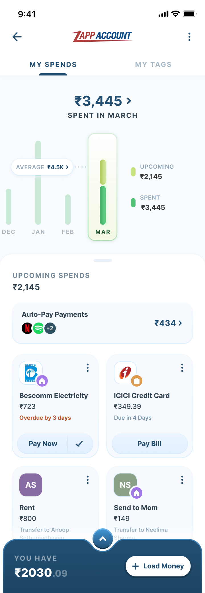
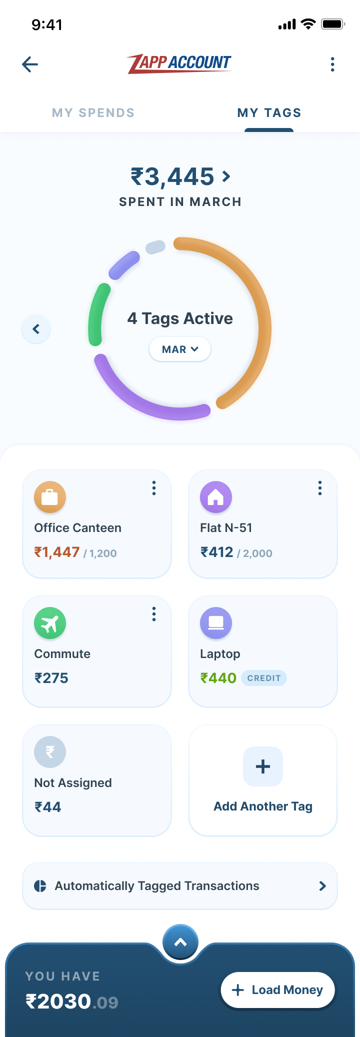
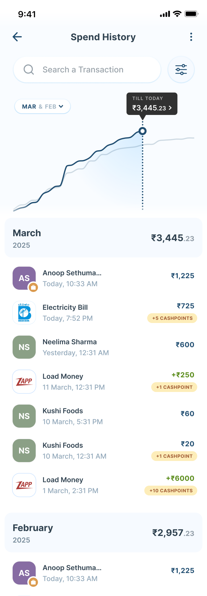
So this approach dropped the target entirely. Instead of asking someone to commit to a number, it would show them their own numbers: what they usually spend across a month, how the current month sits against that average, and what is still due to go out. The detail would populate itself from their spending patterns rather than from a setup screen, so there would be nothing to configure and nothing to fall behind on.
The value would move from restraint to understanding. Paying through Zapp Account would become worth doing because the account could tell you where your money actually went, which is something a bank statement technically holds but never makes readable. Nothing here would pass judgement either: the same overspend a budget would have flagged as a failure would simply read as information.
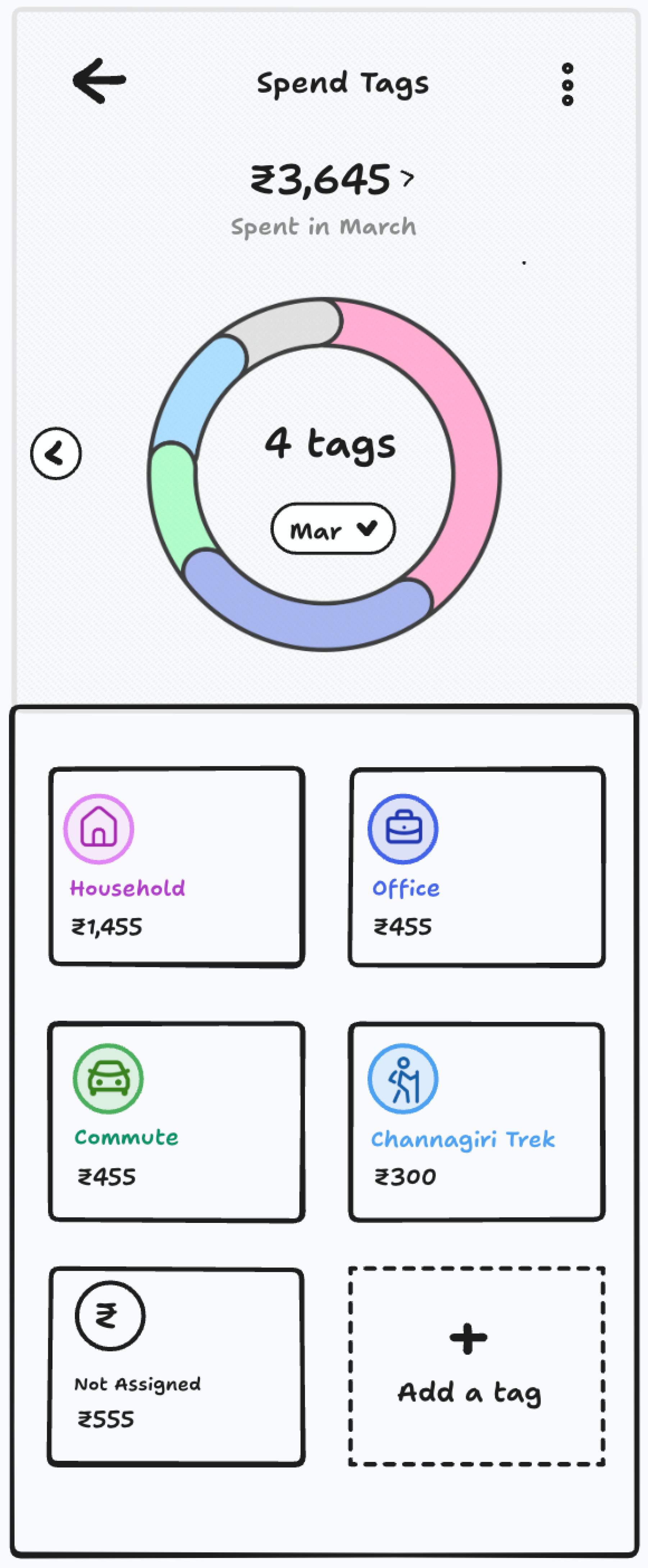
Tags were the other half of it. We looked at grouping spends into categories a person would actually recognise, a commute or a canteen rather than an industry code, and at how much of that could be inferred automatically. Anything needing manual upkeep tends to be abandoned by the second month, so automating the tagging mattered more than offering it.
 Add image in edit mode
 Add image in edit mode
 Add image in edit mode
03 / Plans
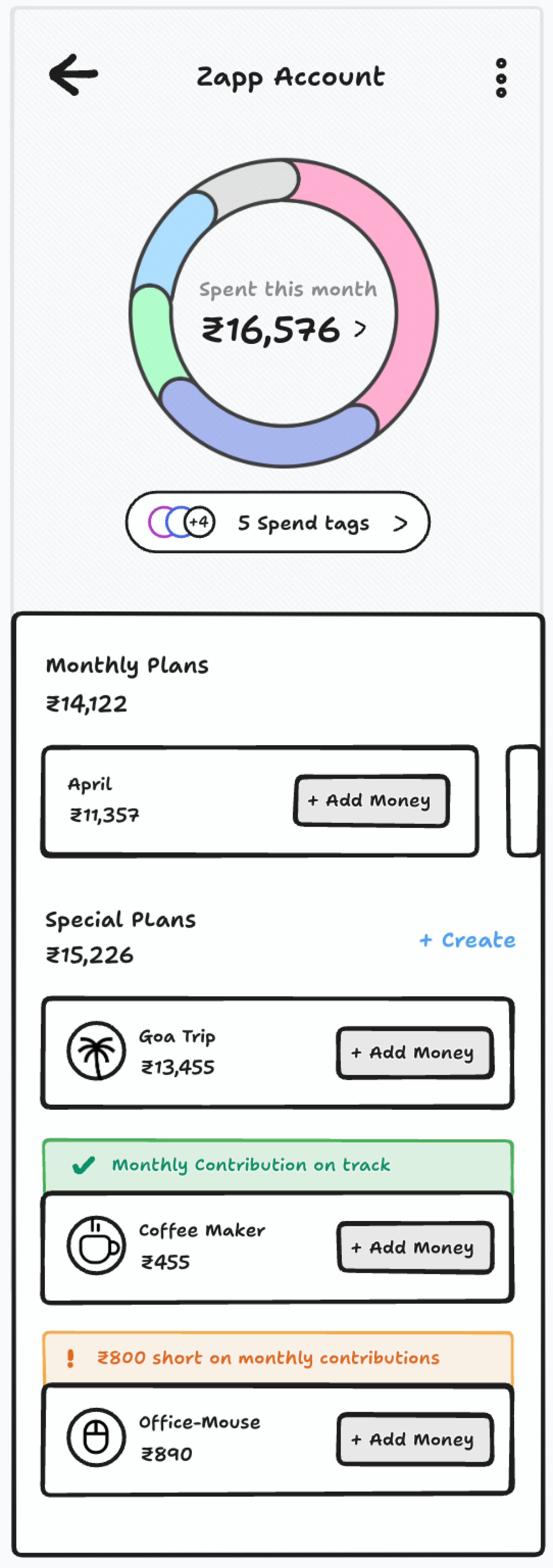
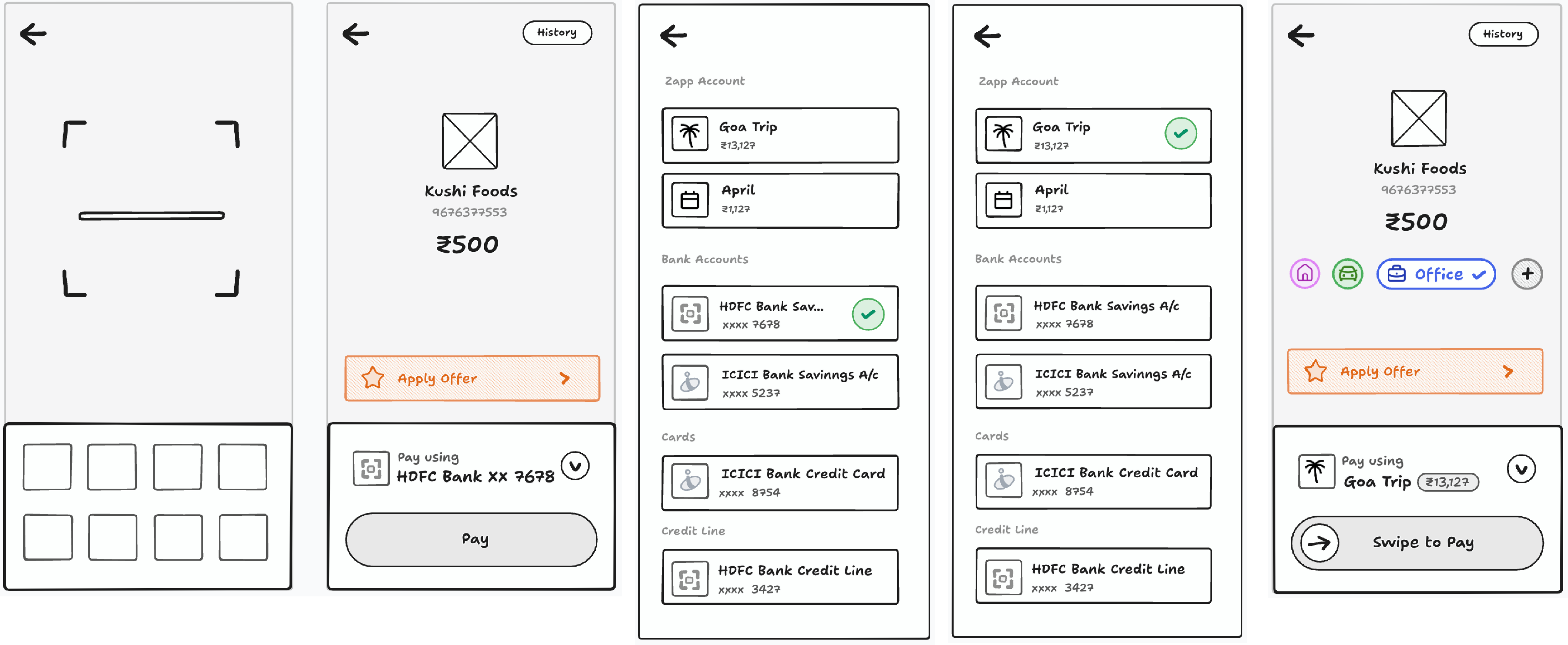
The last of these borrowed from Revolut. Rather than one balance doing everything, money would actually move into separate pockets and stay there, held out of the spendable balance until the plan it belonged to needed it. Each pocket would stand for something specific. We were calling them Plans.
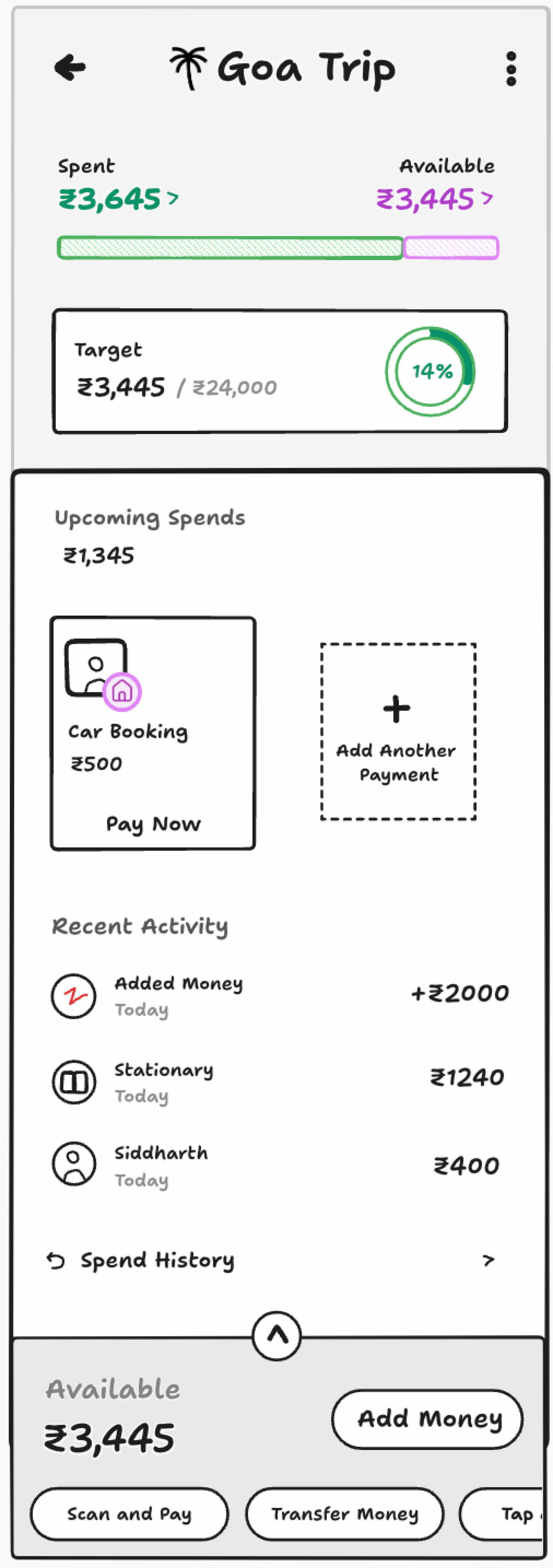
They would come in two forms. Monthly plans would activate on their own every month and hold what someone routinely needs, covering the non-discretionary commitments like rent and bills as well as the discretionary spending they still want room for. Alongside those, dedicated plans could be created for a particular need over a particular stretch of time: a trip later in the year, something being saved up for, anything with its own start and finish.
What appealed to us was that a plan would carry the structure of a budget without the scorekeeping. Because the money genuinely leaves the spendable balance, the commitment would hold on its own and there would be nothing to enforce afterwards: a plan is a decision made once, in advance, when someone is thinking clearly, rather than a limit that reports back on them at the end of the month. It would also stretch across both short-term and long-term saving, so the same mechanism could serve a monthly rhythm and a year-long goal.
 Add image in edit mode
 Add image in edit mode
 Add image in edit mode
 Add wide image in edit mode